
Are you struggling to make sense of market movements while managing your investments? You’re not alone. Many Indian investors find themselves lost in a maze of numbers, percentages, and confusing graphs. What if you could cut through this complexity with a visual tool that reveals market sentiment instantly?
Enter the Nifty 50 candle chart, a powerful visual representation that transforms how you view market trends. Whether monitoring your SIP performance or planning your next market move, understanding candlestick patterns could be the difference between making informed decisions and relying on gut feelings.
In India’s volatile market, where a single policy announcement can trigger dramatic swings in the Nifty 50, the ability to interpret these signals isn’t just helpful, it’s essential for protecting and growing your wealth.
What Is a Nifty 50 Candle Chart?
A Nifty 50 candle chart is a graphical presentation of India’s benchmark index’s price movement over a certain period of time. Unlike the line charts that only present the closing prices, the candlestick charts present four vital price levels:
- Opening price: At which the index began trading
- Closing price: At which the index closed trading
- High price: The highest price that the index attained during that period
- Low price: The lowest price that the index attained during that period
The Nifty 50 index is the weighted average of the top 50 companies listed on the National Stock Exchange (NSE) in India and includes big names like Reliance Industries, HDFC Bank, Infosys, and TCS.
Each candlestick stands for a particular time frame, which could be as short as a minute or as long as a month. The shape, size, and colour convey a different market sentiment for that particular period.
Why Candle Charts Matter in Nifty 50 Analysis?
Candlestick charts are more than just visual tools they offer traders and investors a deeper way to understand the Nifty 50’s daily market activity. Here’s why they’ve become a staple in market analysis:
1. A Visual Representation of Market Psychology
Unlike line charts that simply connect closing prices, candlestick charts provide a complete picture of each trading session, including the opening, closing, high, and low. This helps traders see how the price moved throughout the day and whether bulls or bears were in control.
Each candle is like a mini story. For example:
- A long green candle suggests strong buying momentum.
- A red candle with a long upper wick might indicate sellers pushed back after an early rally.
- A doji candle (where open and close are nearly identical) reflects indecision.
These visual cues simplify complex market behavior into something easy to interpret.
2. Real-Time Sentiment Tracking
Candlestick charts allow traders to track sentiment as it unfolds. Whether you’re viewing the chart by the minute or by the day, candle formations can indicate:
- Buying strength (bullish pressure)
- Selling pressure (bearish trends)
- Uncertainty (sideways or ranging movement)
By reading candle shapes and sequences, traders can better time entries and exits based on what the market is signaling, not just relying on lagging indicators.
3. Pattern Recognition for Predicting Trends
Over time, candles form repeatable patterns that help forecast short-term price movement and longer-term trend shifts. For example:
- A Bullish Engulfing pattern may signal a potential rally.
- A Hammer at the bottom of a downtrend could indicate a reversal.
- A series of small-bodied candles might suggest a period of consolidation before a breakout.
Recognizing these patterns can give Nifty 50 traders an edge in anticipating momentum before it becomes obvious.
What This Means in Practice
Candle charts are popular because they’re practical. They allow new or experienced traders to make better-informed decisions quickly. For anyone following the Nifty 50, learning to read these charts isn’t just a technical skill it’s a strategic advantage.
How to Read a Nifty 50 Candlestick Chart
Basic Structure of a Candlestick
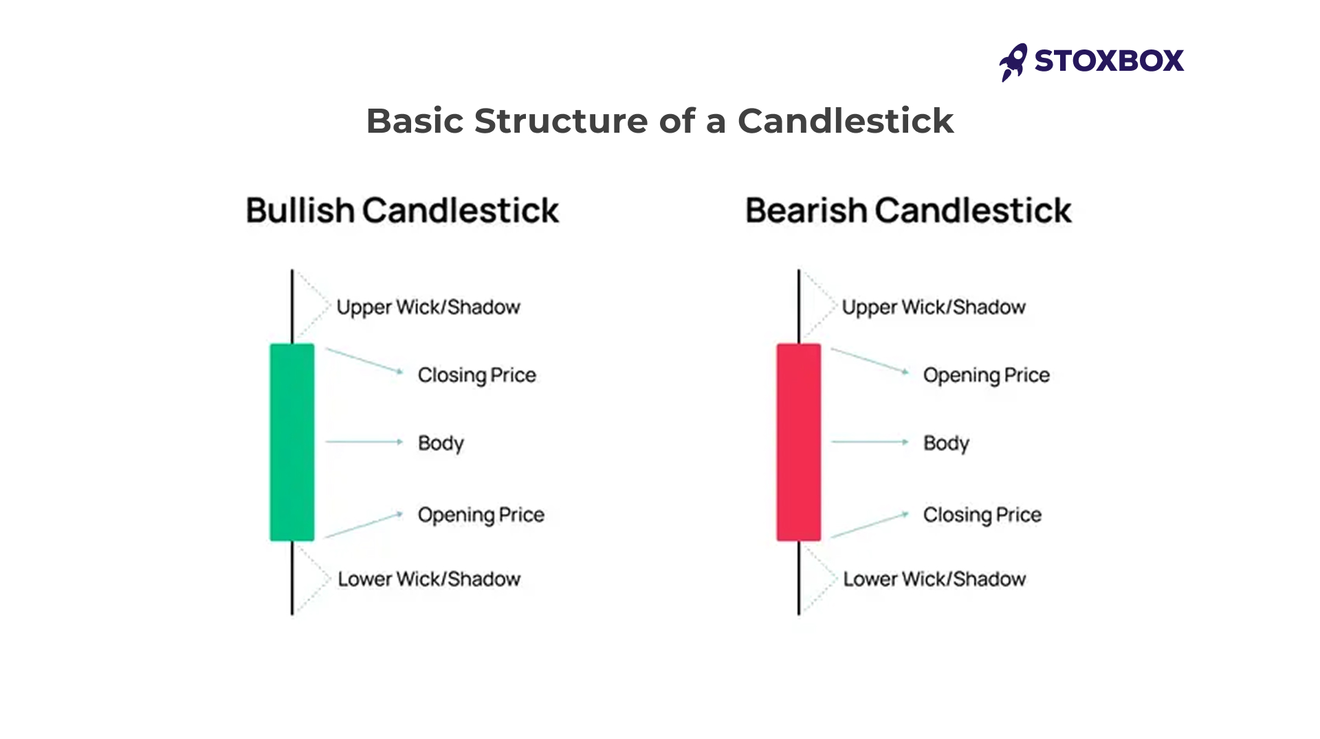
Every candlestick consists of two main components:
- The body: The rectangular part showing the opening and closing prices
- The wicks/shadows: The thin lines from the body indicating high and low prices
The colour immediately tells the direction of the market:
- Green/White candle (Bullish): The closing price is higher than the opening price
- Red/Black candle (Bearish): The closing price is lower than the opening price
Key Candlestick Patterns
These patterns can assist in identifying possible market trends: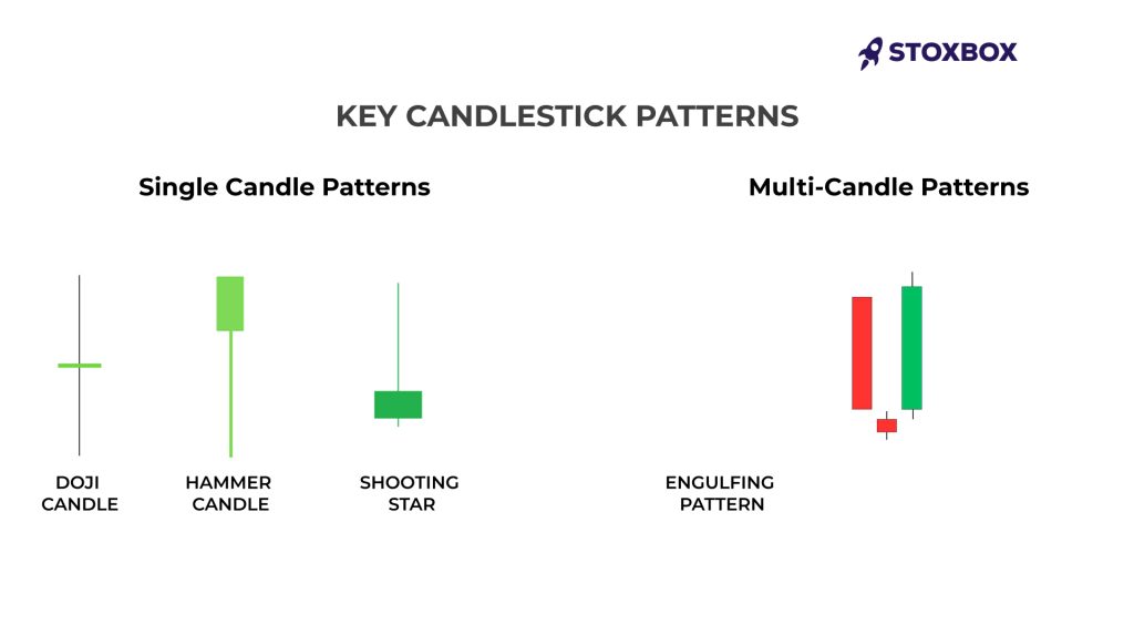
Single Candle Patterns
- Doji: The candles with very little or no body that indicates market indecision
- Hammer: Bullish reversal signal with a small body at the top and a long lower wick
- Shooting Star: Bearish reversal signal with a small body at the bottom and a long upper wick.
Multi-Candle Patterns
- Engulfing Pattern: A candle that completely engulfs the previous candle
- Morning Star: Three-candle bullish reversal pattern often found at market bottoms
- Evening Star: Three-candle bearish reversal pattern often found at market tops
Our StoxBot trading utility can help identify these patterns automatically across different timeframes.
Live Examples: What Today’s Nifty 50 Candle Chart Tells You
Let’s examine a practical example:
Imagine the Nifty 50 has been in an uptrend for several weeks, climbing from ₹21,000 to ₹22,500. In the last three days, we observe:
- Day 1: A long green candle (Nifty rises from ₹22,300 to ₹22,500)
- Day 2: A small doji candle (Nifty opens and closes at nearly the same level)
- Day 3: A long red candle (Nifty drops from ₹22,500 to ₹22,200)
This three-candle formation resembles an “Evening Star” pattern, a bearish reversal signal. The doji indicates indecision after an uptrend, and the following red candle confirms that sellers have gained control.
Remember, no pattern is 100% reliable, which is why StoxCalls premium alerts combine candlestick analysis with other technical indicators.
Common Mistakes in Interpreting Nifty 50 Candle Patterns
Even experienced traders make these common errors:
- Ignoring the broader trend: Individual candle patterns must be interpreted within the context of the larger trend.
- Overlooking volume: Strong volume confirms pattern validity; weak volume reduces significance.
- Seeking perfect patterns: Real-world markets rarely form textbook-perfect patterns.
Neglecting confirmation: Wait for the next candle to confirm a pattern before taking action.
Comparison: Candlestick Charts vs. Other Chart Types
| Feature | Candlestick Charts | Line Charts | Bar Charts |
|---|---|---|---|
| Price information | Open, high, low, close | Closing prices only | Open, high, low, close |
| Visual pattern identification | Excellent | Poor | Good |
| Market psychology insights | Strong | Weak | Moderate |
| Learning curve | Moderate | Very low | Low |
| Popular in Indian markets | Very high | Moderate | Low |
Best Tools to Track Nifty 50 Candle Charts
To effectively analyse Nifty 50 candlestick patterns, you need reliable platforms:
- StoxBox Trading Platform: Our advanced solution offers real-time Nifty 50 candlestick charts with pattern recognition algorithms.
- NSE India Website: The official source provides basic candlestick charts with historical data.
- TradingView: Popular among technical analysts, offering advanced charting features.
For serious traders, StoxBox’s integrated platform combines candlestick charting with advanced technical indicators and direct trade execution.
Conclusion
Take Action with StoxBox
Ready to apply your new knowledge? StoxBox offers several tools to help you leverage this powerful analytical technique:
- StoxCalls Premium Alerts: Expert-vetted signals based on advanced candlestick pattern recognition
- StoxBot Trading Utility: Automate your trading strategy based on candlestick patterns
- StoxBox Trading Platform: Professional-grade candlestick charts with customisable indicators
Sign up today and transform your market analysis capabilities with tools specifically designed for the Indian investor.
Frequently Asked Questions
1. What is the Nifty 50 candle chart?
A Nifty 50 candle chart is a visual representation of price movements in India’s benchmark index, displaying opening, closing, high, and low prices for specific time periods.
2. Which is the best time frame to use for Nifty 50 candle charts?
The optimal timeframe depends on your trading style. Day traders typically use 5-15 minute charts, swing traders prefer daily charts, and long-term investors might focus on weekly charts.
3. Can candle charts predict market movement?
Through candle chart analysis traders can identify patterns which enhance their market direction forecasting capabilities when used alongside additional indicators though they do not guarantee exact movement predictions.
4. Is the use of candle charts appropriate for new traders?
New traders will find candle charts straightforward to learn after grasping their fundamental principles despite their complex appearance. The visual presentation of candlestick charts provides better understanding than numerical data presented in tables.
5. Do candlestick patterns demonstrate varying degrees of effectiveness in the Indian market?
Candlestick patterns function worldwide but their performance in the Indian market remains uncertain because of specific market features such as circuit breakers together with high retail investor participation and global market sensitivity.